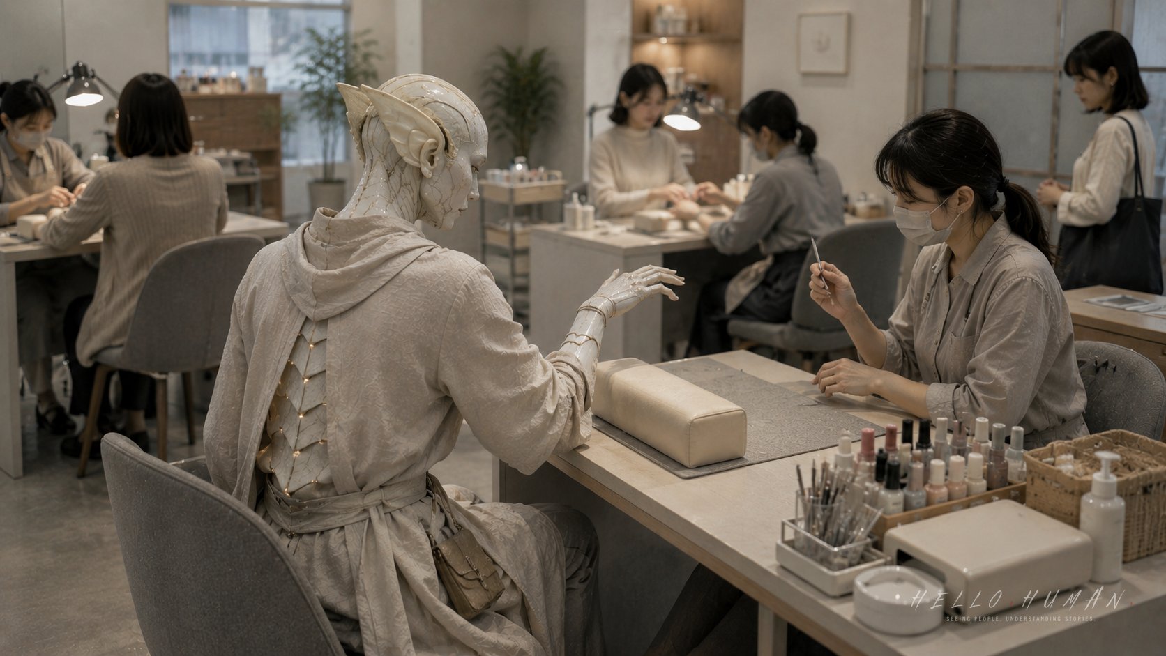
The hand rest sat like a small padded bridge on the nail salon table, close to the lamp and the neat row of tiny bottles.
Across from it, the staff member leaned in without speaking, eyes level with the traveler’s fingertips as the surface caught the light.
Observation 01The Moment Something Changed

The Porcelain-eared traveler thought the service had reached its quiet ending. Their fingers had been still for a long time, and the staff member had stopped applying color.
The traveler’s delicate porcelain ear plates caught a faint blue-white glint as they relaxed. Carefully, almost apologetically, they began to pull their hand away from the hand rest.
The staff member’s own hand paused above the table. A small checking tool stayed suspended near the traveler’s nail surface, not touching, not withdrawing.
The traveler stopped halfway, wrist lifted, fingers slightly curled. The movement was small, but it broke the straight line between the lamp, the nail surface, and the staff member’s final look.
Nothing at the table became loud. The salon’s soft music continued. A dryer hummed nearby. But the hand rest suddenly looked less like a cushion and more like the place where permission had not yet ended.
The visible cue was the traveler’s hand leaving the hand rest while the staff member’s gaze and checking tool were still fixed on the nail surface.
The Japanese reaction appeared as a paused hand rather than a direct correction, with the staff holding the last moment open.
The traveler began to understand that the service was not finished just because the visible painting had stopped.
Observation 02The Reactions No One Explained
The staff member lowered their voice. “Mō sukoshi dake,” they said, gentle enough that it sounded less like instruction than a cushion placed under the moment.
At the next table, another customer glanced down at their own hands and kept them flat on the rest. Their shoulders stayed relaxed, but their stillness became suddenly readable.
The person waiting near the small reception chair adjusted a bag on their lap. They did not look impatient. Their eyes moved from the traveler’s lifted wrist to the hand rest, then away.
A second staff member passed behind the chairs with a towel tray and narrowed their route by a few centimeters. Their steps softened, as if not to disturb the unfinished check at the table.
The traveler felt the warm ceramic planes of their cheeks cool into composure. Their careful fingers, with a porcelain sheen at the knuckles, hovered over the table in a position that no longer belonged to either movement or rest.
The visible cue was the staff member’s attention staying on the surface even after the main work seemed complete.
The Japanese reactions stayed indirect: a lowered voice, still hands at the next table, a waiting gaze toward the hand rest, and softened steps behind the chairs.
The traveler started to see that the hand rest was part of the staff’s timing, not only a comfortable place to put a hand.
Observation 03What the Traveler Finally Understood
The traveler placed their hand back onto the hand rest. They did it slowly, aligning the fingers with the soft ridge so the surface faced the lamp again.
The staff member’s shoulders eased. They leaned in, checked the edge of one nail, turned the traveler’s finger by a fraction, and looked across the surface from another angle.
Only after that did the staff member lift their hand away and give a small nod. The nod was not theatrical. It was simply the release cue the traveler had moved before receiving.
The traveler withdrew their hand then, this time following the staff’s timing. The padded cuff around their wrist cleared the porcelain knuckle sheen without catching, and a faint blue-white edge at the cuff seam flickered once as the gesture stopped cleanly.
What they understood was that the final check belonged to the service. At a Japanese nail salon table, the hand rest helps hold the body still until the staff can confirm the surface, the edges, and the finish without chasing a moving hand.
The visible correction came first: the traveler returned the hand to the hand rest and let the staff finish looking at the surface.
The Japanese response changed through eased shoulders, a completed check, and a small nod that released the hand.
The traveler understood that the end of the service is often marked by the staff’s cue, not by the customer’s guess that the work is done.
Practical Takeaway
At a nail salon table in Japan, keep your hand on the hand rest until the staff gives a clear release cue, such as a nod, a phrase, or a gentle shift away from your hand. Do not pull away while they are still checking the surface.
This matters because the final check is part of the service rhythm. Moving early can make the staff pause, recheck, or adjust their timing, even when no one directly says you made a mistake.
Pay attention whenever your hand, foot, hair, face, or clothing is being positioned by staff in a personal care setting. If their gaze, tool, or hand is still focused on the work area, wait for the cue before moving.
More Observations
A realistic editorial still at a Sendai nail salon table during lunch rush, wide room rhythm shot, the hand rest centered as the traveler pulls their hand away before the staff has finished checking the nail surface with a small tool. The traveler is a Porcelain-eared traveler, a refined humanoid in warm porcelain and soft gray tones, with exactly three visible proof zones: porcelain ear plates, warm ceramic cheek planes, and porcelain knuckle sheen. They wear a soft cocoon-silhouette hooded wrap tunic over tapered gray trousers with padded cuff adaptation clear of porcelain edges, plus a small hand pouch; a faint blue-white edge glows at one cuff seam. Nearby Japanese people react with the staff hand paused, another customer keeping hands still on a rest, and one waiting person glancing down then away. Documentary editorial realism, natural indoor light, no readable text, no logos, no phone UI, no anime, no fantasy illustration, no portrait, no hero shot.
Describe the visitor as a true resident of another civilization, a refined humanoid traveler who is humanlike but not fully human and not a modified human with fantasy add-ons. The traveler species must remain the selected species from HH_SEED when provided; do not replace it with a generic refined humanoid, elf-like traveler, plantlike visitor, or unrelated species, and preserve its body logic plus at least three species-specific proof zones. When the selected species is wood-, bark-, cedar-, plant-, mineral-, textile-, glass-, metal-, paper-, or other material-based, interpret it as refined body logic rather than a monster or fantasy creature; keep the face calm and socially believable, the head silhouette clean rather than spiky or crown-like, material surfaces refined rather than rough armor, and hands dexterous rather than claws, roots, or talons. Maintain a distinct body palette for the selected species; do not default to pale white, ivory, ash-gray, linen beige, or near-monochrome body tones unless the species explicitly requires it, and keep the body palette visually separate from clothing so the species identity remains readable. Root archetype traits must be integrated into anatomy, not added as accessory-like ears, horns, wings, tails, scales, fangs, or glow. The traveler must not read as a normal human with one symbolic fantasy feature attached. Do not limit species-adaptive wear to fit. Clothing, bags, straps, pouches, footwear, fasteners, and small carried items should function as quiet everyday containment or regulation tools, helping carry, soften, stabilize, vent, buffer, conceal, or guide selected-species heat, light, moisture, growth, resonance, particles, or material traits in human public spaces. The final prompt must name one or two camera-readable containment features tied to the selected body logic, such as a split collar around a neck fin, moisture-safe strap route, heat-diffusing bag panel, growth-guiding stitched edge, widened cuff, glow-softening lining, stabilizing fastener, light-buffering pocket, or pressure-diffusing strap geometry. If a bag, pouch, backpack, tote, satchel, document case, strap, or carried item appears, at least one camera-facing species-containment proof detail must be visible in its routing, opening, lining, seam, vent, hardware, material family, surface behavior, or subtle leakage sign; a generic ordinary bag is insufficient. The feature must be readable without zooming and not hidden by shadow, crop, pose, table, outer clothing, or sleeve overlap. Keep it practical, ordinary, non-weaponized, non-magical, non-costume-like, and secondary to the body; never weapons, armor, battle gear, ritual props, cosplay, tokusatsu props, superhero equipment, decorative-only motifs, or the source of body-bound glow. Any leakage sign must remain subtle daily evidence, not spectacle. Keep the visitor clean, dignified, approachable, quietly strange, slightly future-facing, and socially believable in real Japan. Build from body logic first, not from a human base; body, clothing, carried objects, posture, material, and glow should feel evolved from the same civilization. Include at least three visible non-human proof zones at a glance, such as silhouette, hands, neck/face structure, surface material continuity, localized body-bound glow, clothing-body integration, posture, or carried-object logic. Ears, skin color, hand color, face markings, hair/eye color, or glow alone are not enough. Avoid a normal attractive human, elf hero, fashion model, cosplayer, ordinary tourist, insect monster, dirty creature, horror figure, tokusatsu villain, rubber suit, mascot, toy, superhero costume, or fashion advertisement. Non-human traits and the localized glow must look biological or naturally part of the body, not accessories, makeup, prosthetics, gadget lights, LED props, glowing tattoos, costume parts, armor details, or decorative fashion gimmicks. Include one subtle but visible localized body-bound glow as a natural body trait, never LED, gadget, armor light, tattoo, or makeup. Good locations include eyes, ear edge, collarbone, throat, wrist, fingertips, hair material, or neck transition; no magical aura, scene-wide glow, neon overload, or cyberpunk armor light. Keep the face approachable but slightly otherworldly, with believable humanoid proportions, refined skin or material depth, pleasant unusual eyes, soft asymmetry, and no compound eyes, mouthparts, sharp teeth, corpse face, hollow eyes, or horror mask look. Use clean travel-ready layered clothing that physically fits the visitor’s anatomy; sleeve-to-arm transitions look integrated rather than costume-like, and any shoulder strap naturally fits the unusual torso. Clothing, footwear, bags, straps, hats, scarves, umbrellas, and travel items must physically fit the visitor’s anatomy without clipping through ears, horns, wings, tails, shoulders, hair, feet, or luminous features. Use gentle shadowed torso contour, soft interior dusk tone, or collarbone-like luminous line; avoid skeletal, corpse-like, horror hollow, exposed-rib, or frightening torso-void interpretations. Authentic public markings such as a correct Japanese road marking may appear only when necessary for realism; no fake, garbled, invented, decorative, or mistranslated text, and no invented readable shop names, station names, product labels, menus, posters, brand logos, phone UI, ticket text, or map text. If text cannot be rendered accurately, keep it blurred, cropped, distant, worn, angled, or unreadable. When products, packages, sealed goods, menus, posters, notices, non-essential signs, or retail displays appear, avoid both plain blank white surfaces and crisp fake print. Use non-readable package-like structure such as subtle color bands, blank label panels, pastel backing cards, transparent sleeves, silver backs, folded plastic reflections, soft gradients, non-text divider lines, low-detail print areas, or small color tabs. Keep any print or imagery unreadable and unrecognizable through glare, soft blur, reflections, distance, shallow depth of field, or low-detail printing; no pseudo-Japanese, pseudo-English, random glyphs, readable letters, logos, brands, mascots, faces, character art or silhouettes, barcode-like detail, woodgrain, leather texture, or unrelated material patterns. This does not remove the text policy exception for an accurate public marking when it is necessary to the scene. The editorial Japanese setting, subtle human hesitation, and central social mistake must remain readable at a glance; do not turn the image into a character portrait.
[/IMAGE_PROMPT_BLOCK]