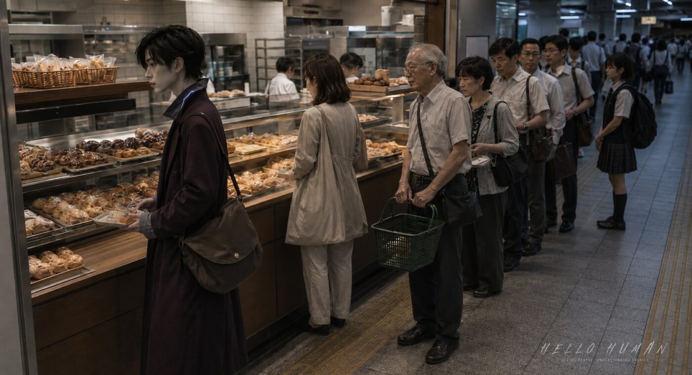
The station bakery smelled of butter, paper bags, and outside heat brought in on shirtsleeves. Evening commute footsteps passed the open entrance in a steady current, fast enough to make the shop feel smaller.
Ren saw a gap near the pastry shelves and stepped into it. The station bakery line looked loose, but the queue was marked only by people’s spacing.
Observation 01The Moment Something Changed

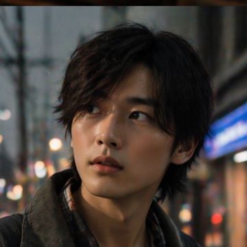
Ren held a small tray with two wrapped rolls, standing where the display shelf opened toward the register. Their high narrow collarbone line stayed shaded by a light-softening collar, and their careful pale-knuckle hands kept the tray steady.
The gap seemed practical. A woman with a tote bag stood near the drink case, not directly behind anyone. An elderly customer waited a few steps farther back, angled toward the register but leaving space for people to pass.
Ren read the gap as an invitation and moved into it. The motion was smooth, almost too confident for the slow geometry of the line.
The woman with the tote bag did not speak. She shifted her tray closer to her body, making its edge parallel with the register path.
The elderly customer stopped advancing. His hand hovered above the handle of his shopping basket, and his eyes lowered to the floor between his shoes and Ren’s place in the line.
The visible cue was a station bakery line whose end was marked by spacing, body angle, and waiting posture rather than a rope or sign.
The Japanese reaction appeared as still trays, lowered eyes, and a halted step instead of someone saying the line had been cut.
Ren first understood only that the gap was not as empty as it had looked.
Observation 02The Reactions No One Explained
The woman with the tote bag drew one foot back, not enough to challenge Ren, but enough to show her original place. Her shoulders stayed toward the register, and her gaze remained on the cashier’s hands.
The elderly customer adjusted his basket with both hands and let the handle rest against his wrist. He did not sigh. He simply held his place, making the distance behind the woman visible.
A commuter behind him turned slightly sideways to let passing people slip through the shop entrance, then closed the space again. The queue did not form a straight line; it breathed around the rush hour flow.
Near the shelf, a student with a tray paused before reaching for tongs. She glanced from Ren to the elderly customer, then lowered her eyes to the pastries without taking one.
Ren felt the fluorescent light press harder along their temples. The cool shadows there deepened under the heatwave brightness, and a muted gleam showed briefly at the collar edge before the smoke-gray lining softened it again.
No one accused Ren of cutting. That made the signal slower to arrive. The correction was built from tiny choices: holding position, tightening spacing, keeping the body aimed toward the register, and not following Ren’s mistaken lead.
The visible cue was the queue rebuilding itself around Ren: one foot back, one basket held still, one sideways commuter returning to place.
The Japanese people protected the line by preserving order through posture and spacing, not by making a public scene.
Ren began to understand that a loose-looking line can still be exact when everyone is reading the same body map.
Observation 03What the Traveler Finally Understood
Ren looked again, this time from the register backward. The woman with the tote bag, the elderly customer, the sideways commuter, and the student near the shelf were not scattered shoppers. They were a line shaped around a narrow shop.
Ren lifted the tray slightly, stepped out of the gap, and moved behind the elderly customer. Their matte shoulder bag stayed close to their side, shaded interior pocket turned inward, avoiding the passing flow near the entrance.
The change was immediate but quiet. The woman with the tote bag advanced half a step. The elderly customer’s basket lowered. The commuter behind him shifted just enough to include Ren at the end.
Ren did not need a spoken explanation after that. The end of the queue had been marked by people’s spacing, by the direction of their feet, by who was waiting without browsing, and by who protected room for commuters to pass.
In a station bakery during evening commute, the line was not always a neat file. It could bend around shelves, open a gap for traffic, and still remain ordered. Ren had mistaken courtesy space for available space.
The visible correction was physical first: Ren stepped out of the loose-looking gap and joined behind the elderly customer.
The Japanese line accepted the repair by moving again, with no announcement and no direct blame.
Ren finally understood that the queue was marked not by barriers, but by shared attention to spacing and sequence.
Practical Takeaway
Before joining a station bakery line in Japan, scan from the register backward. Look for people facing the counter, holding trays still, leaving passage gaps, or standing slightly apart without browsing.
This matters because small shops often keep flow working through spacing instead of barriers. During rush hour, a gap may be there for passing commuters, elderly customers, or shelf access, not for entering the queue.
Pay attention when nearby people stop advancing, tighten their spacing, lower their eyes, or keep their bodies aimed toward the register. Those cues often mean you have stepped into the line before its actual end.
More Observations
A realistic editorial still from the article’s central scene: a compact Japanese station bakery during evening commute in a heatwave, side-angle shared-line composition showing the pastry shelves, register direction, a loose-looking station bakery line, and passing station flow at the entrance. Ren, a Night-collar guest, has just made the visual mistake of stepping into a loose-looking station bakery line because the end of the queue is marked only by people’s spacing; Ren stands in the gap with a small tray while the actual line continues behind them around the shelf. Ren is a refined vampire-derived humanoid visitor with quiet nocturnal body logic, not goth costume, not horror vampire, no blood, no seductive styling, no villain cape; integrated proof zones include high narrow collarbone line, cool temple shadows, subtle non-horror fang logic kept barely visible, careful pale-knuckle hands holding the tray, and still nocturnal posture. Body palette: night plum, warm gray, muted red-brown under-shadows, low pearl edge light. Localized body-bound glow: a cool muted gleam at the collar edge only, softened by smoke-gray lining, not LED, not magic aura, not neon. Clothing adaptation: quiet light-softening collar and cuff layers near the cool neck line, deep plum wool blend with smoke-gray lining, matte shoulder bag with a shaded interior pocket for daily items, strap fitted naturally without theatrical styling. Social tension is readable through subtle Japanese reactions: a woman with a tote bag holds her tray closer and keeps shoulders toward the register, an elderly customer stops advancing with basket still, a commuter turns sideways then closes the space again, a student near the shelf pauses with lowered eyes. Documentary/editorial photography, realistic fluorescent station-shop light, wide enough to show the bakery line, people’s spacing, Ren’s mistaken position, and rush hour flow; no readable text, logos, posters, signs, phone UI, menu text, brand names, labels, anime style, fantasy illustration, fashion pose, hero shot, or dramatic reveal.
Describe the visitor as a true resident of another civilization, a refined humanoid traveler who is humanlike but not fully human and not a modified human with fantasy add-ons. The traveler species must remain the selected species from HH_SEED when provided; do not replace it with a generic refined humanoid, elf-like traveler, plantlike visitor, or unrelated species, and preserve its body logic plus at least three species-specific proof zones. When the selected species is wood-, bark-, cedar-, plant-, mineral-, textile-, glass-, metal-, paper-, or other material-based, interpret it as refined body logic rather than a monster or fantasy creature; keep the face calm and socially believable, the head silhouette clean rather than spiky or crown-like, material surfaces refined rather than rough armor, and hands dexterous rather than claws, roots, or talons. Maintain a distinct body palette for the selected species; do not default to pale white, ivory, ash-gray, linen beige, or near-monochrome body tones unless the species explicitly requires it, and keep the body palette visually separate from clothing so the species identity remains readable. Root archetype traits must be integrated into anatomy, not added as accessory-like ears, horns, wings, tails, scales, fangs, or glow. The traveler must not read as a normal human with one symbolic fantasy feature attached. Do not limit species-adaptive wear to fit. Clothing, bags, straps, pouches, footwear, fasteners, and small carried items should function as quiet everyday containment or regulation tools, helping carry, soften, stabilize, vent, buffer, conceal, or guide selected-species heat, light, moisture, growth, resonance, particles, or material traits in human public spaces. The final prompt must name one or two camera-readable containment features tied to the selected body logic, such as a split collar around a neck fin, moisture-safe strap route, heat-diffusing bag panel, growth-guiding stitched edge, widened cuff, glow-softening lining, stabilizing fastener, light-buffering pocket, or pressure-diffusing strap geometry. If a bag, pouch, backpack, tote, satchel, document case, strap, or carried item appears, at least one camera-facing species-containment proof detail must be visible in its routing, opening, lining, seam, vent, hardware, material family, surface behavior, or subtle leakage sign; a generic ordinary bag is insufficient. The feature must be readable without zooming and not hidden by shadow, crop, pose, table, outer clothing, or sleeve overlap. Keep it practical, ordinary, non-weaponized, non-magical, non-costume-like, and secondary to the body; never weapons, armor, battle gear, ritual props, cosplay, tokusatsu props, superhero equipment, decorative-only motifs, or the source of body-bound glow. Any leakage sign must remain subtle daily evidence, not spectacle. Keep the visitor clean, dignified, approachable, quietly strange, slightly future-facing, and socially believable in real Japan. Build from body logic first, not from a human base; body, clothing, carried objects, posture, material, and glow should feel evolved from the same civilization. Include at least three visible non-human proof zones at a glance, such as silhouette, hands, neck/face structure, surface material continuity, localized body-bound glow, clothing-body integration, posture, or carried-object logic. Ears, skin color, hand color, face markings, hair/eye color, or glow alone are not enough. Avoid a normal attractive human, elf hero, fashion model, cosplayer, ordinary tourist, insect monster, dirty creature, horror figure, tokusatsu villain, rubber suit, mascot, toy, superhero costume, or fashion advertisement. Non-human traits and the localized glow must look biological or naturally part of the body, not accessories, makeup, prosthetics, gadget lights, LED props, glowing tattoos, costume parts, armor details, or decorative fashion gimmicks. Include one subtle but visible localized body-bound glow as a natural body trait, never LED, gadget, armor light, tattoo, or makeup. Good locations include eyes, ear edge, collarbone, throat, wrist, fingertips, hair material, or neck transition; no magical aura, scene-wide glow, neon overload, or cyberpunk armor light. Keep the face approachable but slightly otherworldly, with believable humanoid proportions, refined skin or material depth, pleasant unusual eyes, soft asymmetry, and no compound eyes, mouthparts, sharp teeth, corpse face, hollow eyes, or horror mask look. Use clean travel-ready layered clothing that physically fits the visitor’s anatomy; sleeve-to-arm transitions look integrated rather than costume-like, and any shoulder strap naturally fits the unusual torso. Clothing, footwear, bags, straps, hats, scarves, umbrellas, and travel items must physically fit the visitor’s anatomy without clipping through ears, horns, wings, tails, shoulders, hair, feet, or luminous features. Use gentle shadowed torso contour, soft interior dusk tone, or collarbone-like luminous line; avoid skeletal, corpse-like, horror hollow, exposed-rib, or frightening torso-void interpretations. Authentic public markings such as a correct Japanese road marking may appear only when necessary for realism; no fake, garbled, invented, decorative, or mistranslated text, and no invented readable shop names, station names, product labels, menus, posters, brand logos, phone UI, ticket text, or map text. If text cannot be rendered accurately, keep it blurred, cropped, distant, worn, angled, or unreadable. When products, packages, sealed goods, menus, posters, notices, non-essential signs, or retail displays appear, avoid both plain blank white surfaces and crisp fake print. Use non-readable package-like structure such as subtle color bands, blank label panels, pastel backing cards, transparent sleeves, silver backs, folded plastic reflections, soft gradients, non-text divider lines, low-detail print areas, or small color tabs. Keep any print or imagery unreadable and unrecognizable through glare, soft blur, reflections, distance, shallow depth of field, or low-detail printing; no pseudo-Japanese, pseudo-English, random glyphs, readable letters, logos, brands, mascots, faces, character art or silhouettes, barcode-like detail, woodgrain, leather texture, or unrelated material patterns. This does not remove the text policy exception for an accurate public marking when it is necessary to the scene. The editorial Japanese setting, subtle human hesitation, and central social mistake must remain readable at a glance; do not turn the image into a character portrait.
[/IMAGE_PROMPT_BLOCK]