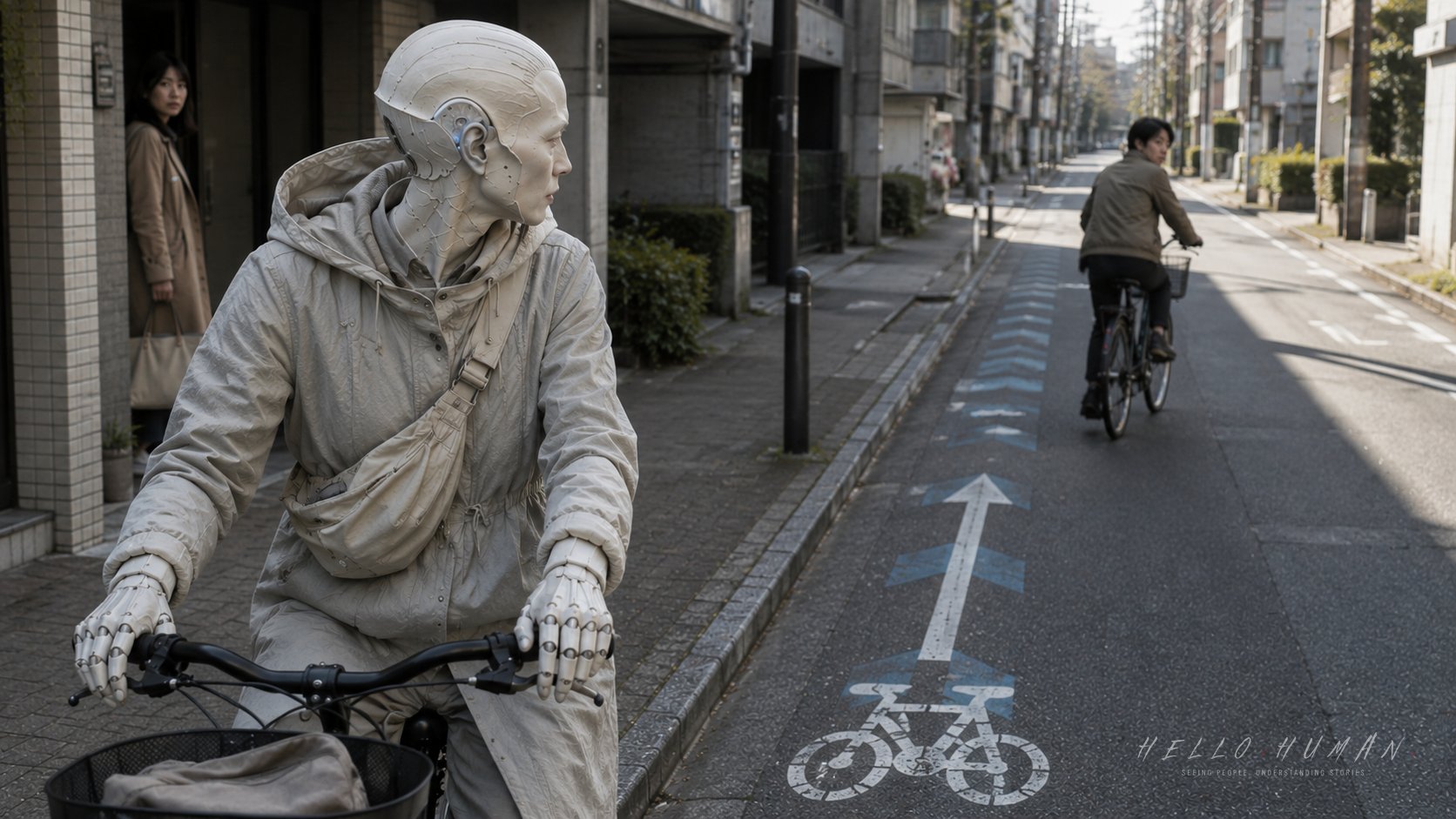
The white bicycle symbol appeared beneath the traveler’s front wheel, followed by an arrow pointing directly behind them.
Along the left edge of the Tokyo roadway, two cyclists ahead were moving toward the traveler instead of away.
Observation 01The Moment Something Changed

The traveler had noticed the bicycle painted on the asphalt and understood half of the message. This strip near the left edge of the roadway was where a bicycle belonged. The smaller directional arrow seemed less important, almost like a decorative extension of the symbol.
They continued riding over the mark in the direction opposite to the arrow. Their careful fingers stayed light on the brake levers, and the porcelain sheen at their knuckles flashed whenever the handlebars shifted around a drain cover.
An approaching cyclist looked up. Nothing dramatic happened. The cyclist simply stopped pedaling for a moment and moved several centimeters closer to the outer edge of the marked area.
The traveler moved slightly too, but toward the same narrow opening. For one second, both bicycles entered a slow, uncertain negotiation that the road marking had been designed to prevent.
The bicycle symbol identified the expected road space, but the painted arrow also carried a directional instruction.
The approaching cyclist responded by slowing and adjusting position rather than calling out.
The traveler noticed that the awkwardness began before either bicycle came close enough to collide.
Observation 02The Reactions No One Explained
The first cyclist passed with one shoulder angled inward and both hands held unusually still. Their gaze dropped briefly to the arrow beneath the traveler’s wheels, then returned to the open roadway ahead.
A second cyclist behind them reduced speed earlier. A shopping bag hanging from the front basket stopped swaying as the rider braked, waited for a clearer path, and then slipped past without speaking.
Near the curb, a pedestrian preparing to cross a side entrance paused with one foot forward. The pedestrian looked toward the normal bicycle flow, then toward the traveler coming from the unexpected direction, and quietly stepped back.
No one pointed at the symbol. No one explained that the traveler had read only the bicycle shape and ignored the arrow. Yet every small reaction gathered around the same painted object: a lowered speed, an angled handlebar, a delayed step, a glance toward the road.
The traveler felt the faint blue-white edge along one porcelain ear plate brighten when their head stopped turning. The people nearby were not reacting to an unfamiliar face or an unusual body. They were reacting to a bicycle arriving from the direction the marking said it should not.
Nearby cyclists slowed and changed their lines because the traveler appeared inside an expected one-way flow.
A pedestrian delayed crossing after checking both the usual direction and the unexpected one.
The traveler began to separate personal discomfort from the practical warning carried by those reactions.
Observation 03What the Traveler Finally Understood
The traveler braked beside a break in the roadside flow and placed one foot down. Their posture folded carefully around the bicycle, with the padded cuffs held clear of the porcelain edges at their wrists.
They turned the bicycle around before moving again. The correction was physical and plain: front wheel lifted slightly, rear wheel guided through a small arc, handlebars aligned with the painted arrow.
Now the navigation mark read as one complete message. The bicycle symbol showed the part of the roadway intended for bicycle travel, while the arrow showed the direction bicycles should follow there. Riding over the symbol against its arrow had not merely looked unusual; it had reversed the flow expected under the existing traffic rules.
Once the traveler began moving with the arrow, the scene changed without ceremony. An approaching rider no longer needed to brake. The pedestrian at the side entrance checked one direction, found the movement predictable, and crossed after the bicycle passed.
The traveler’s hands settled. The blue-white glint at the porcelain edges softened as the repeated pattern of symbols and arrows continued ahead, each one confirming the same direction before the next stretch of road.
The traveler corrected the mistake by turning the bicycle around and aligning with the painted arrow.
The surrounding flow became predictable again, so nearby people no longer needed extra hesitation or avoidance.
The traveler understood that the bicycle and arrow formed a single road instruction, not two separate visual hints.
Practical Takeaway
When a Tokyo roadway has a painted bicycle navigation symbol with an arrow, ride in the direction the arrow shows. Do not ride a bicycle over the navigation mark in the direction opposite to its painted arrow.
The marking communicates both where bicycles should travel and how that bicycle flow is expected to move. Following it helps cyclists and pedestrians predict where another bicycle will come from without needing a spoken correction.
Pay particular attention when entering a marked stretch from a side street, turning around, or joining the roadway after stopping. Check the arrow before moving, even when the bicycle symbol itself already seems familiar.
More Observations
A realistic editorial still at the left edge of a lightly busy Tokyo roadway, framed as a hands-and-object medium detail. A painted bicycle navigation symbol and directional arrow are clear on the asphalt while the traveler rides directly against the arrow, meeting two oncoming cyclists in the marked flow. One cyclist brakes with angled handlebars; another waits behind; a nearby pedestrian pauses at a side entrance. The Porcelain-eared traveler is a refined humanoid in a warm_porcelain_gray palette, not a normal human with decorative ears: integrated porcelain ear plates shape the skull line, warm ceramic cheek and throat planes continue into the neck, and careful fingers show porcelain knuckle structure. Soft cotton cycling layers have a hood opening and padded cuffs clear of the porcelain edges, with a small chip-safe hand pouch. A subtle blue-white body-bound glint catches one ear edge. Documentary photography, natural daylight, restrained local tension, no confrontation, no readable text, no logos, no phone UI, no anime, no fantasy illustration, no portrait, no hero shot.
Describe the visitor as a true resident of another civilization, a refined humanoid traveler who is humanlike but not fully human and not a modified human with fantasy add-ons. The traveler species must remain the selected species from HH_SEED when provided; do not replace it with a generic refined humanoid, elf-like traveler, plantlike visitor, or unrelated species, and preserve its body logic plus at least three species-specific proof zones. When the selected species is wood-, bark-, cedar-, plant-, mineral-, textile-, glass-, metal-, paper-, or other material-based, interpret it as refined body logic rather than a monster or fantasy creature; keep the face calm and socially believable, the head silhouette clean rather than spiky or crown-like, material surfaces refined rather than rough armor, and hands dexterous rather than claws, roots, or talons. Maintain a distinct body palette for the selected species; do not default to pale white, ivory, ash-gray, linen beige, or near-monochrome body tones unless the species explicitly requires it, and keep the body palette visually separate from clothing so the species identity remains readable. Root archetype traits must be integrated into anatomy, not added as accessory-like ears, horns, wings, tails, scales, fangs, or glow. The traveler must not read as a normal human with one symbolic fantasy feature attached. Do not limit species-adaptive wear to fit. Clothing, bags, straps, pouches, footwear, fasteners, and small carried items should function as quiet everyday containment or regulation tools, helping carry, soften, stabilize, vent, buffer, conceal, or guide selected-species heat, light, moisture, growth, resonance, particles, or material traits in human public spaces. The final prompt must name one or two camera-readable containment features tied to the selected body logic, such as a split collar around a neck fin, moisture-safe strap route, heat-diffusing bag panel, growth-guiding stitched edge, widened cuff, glow-softening lining, stabilizing fastener, light-buffering pocket, or pressure-diffusing strap geometry. If a bag, pouch, backpack, tote, satchel, document case, strap, or carried item appears, at least one camera-facing species-containment proof detail must be visible in its routing, opening, lining, seam, vent, hardware, material family, surface behavior, or subtle leakage sign; a generic ordinary bag is insufficient. The feature must be readable without zooming and not hidden by shadow, crop, pose, table, outer clothing, or sleeve overlap. Keep it practical, ordinary, non-weaponized, non-magical, non-costume-like, and secondary to the body; never weapons, armor, battle gear, ritual props, cosplay, tokusatsu props, superhero equipment, decorative-only motifs, or the source of body-bound glow. Any leakage sign must remain subtle daily evidence, not spectacle. Keep the visitor clean, dignified, approachable, quietly strange, slightly future-facing, and socially believable in real Japan. Build from body logic first, not from a human base; body, clothing, carried objects, posture, material, and glow should feel evolved from the same civilization. Include at least three visible non-human proof zones at a glance, such as silhouette, hands, neck/face structure, surface material continuity, localized body-bound glow, clothing-body integration, posture, or carried-object logic. Ears, skin color, hand color, face markings, hair/eye color, or glow alone are not enough. Avoid a normal attractive human, elf hero, fashion model, cosplayer, ordinary tourist, insect monster, dirty creature, horror figure, tokusatsu villain, rubber suit, mascot, toy, superhero costume, or fashion advertisement. Non-human traits and the localized glow must look biological or naturally part of the body, not accessories, makeup, prosthetics, gadget lights, LED props, glowing tattoos, costume parts, armor details, or decorative fashion gimmicks. Include one subtle but visible localized body-bound glow as a natural body trait, never LED, gadget, armor light, tattoo, or makeup. Good locations include eyes, ear edge, collarbone, throat, wrist, fingertips, hair material, or neck transition; no magical aura, scene-wide glow, neon overload, or cyberpunk armor light. Keep the face approachable but slightly otherworldly, with believable humanoid proportions, refined skin or material depth, pleasant unusual eyes, soft asymmetry, and no compound eyes, mouthparts, sharp teeth, corpse face, hollow eyes, or horror mask look. Use clean travel-ready layered clothing that physically fits the visitor’s anatomy; sleeve-to-arm transitions look integrated rather than costume-like, and any shoulder strap naturally fits the unusual torso. Clothing, footwear, bags, straps, hats, scarves, umbrellas, and travel items must physically fit the visitor’s anatomy without clipping through ears, horns, wings, tails, shoulders, hair, feet, or luminous features. Use gentle shadowed torso contour, soft interior dusk tone, or collarbone-like luminous line; avoid skeletal, corpse-like, horror hollow, exposed-rib, or frightening torso-void interpretations. Authentic public markings such as a correct Japanese road marking may appear only when necessary for realism; no fake, garbled, invented, decorative, or mistranslated text, and no invented readable shop names, station names, product labels, menus, posters, brand logos, phone UI, ticket text, or map text. If text cannot be rendered accurately, keep it blurred, cropped, distant, worn, angled, or unreadable. When products, packages, sealed goods, menus, posters, notices, non-essential signs, or retail displays appear, avoid both plain blank white surfaces and crisp fake print. Use non-readable package-like structure such as subtle color bands, blank label panels, pastel backing cards, transparent sleeves, silver backs, folded plastic reflections, soft gradients, non-text divider lines, low-detail print areas, or small color tabs. Keep any print or imagery unreadable and unrecognizable through glare, soft blur, reflections, distance, shallow depth of field, or low-detail printing; no pseudo-Japanese, pseudo-English, random glyphs, readable letters, logos, brands, mascots, faces, character art or silhouettes, barcode-like detail, woodgrain, leather texture, or unrelated material patterns. This does not remove the text policy exception for an accurate public marking when it is necessary to the scene. The editorial Japanese setting, subtle human hesitation, and central social mistake must remain readable at a glance; do not turn the image into a character portrait.
[/IMAGE_PROMPT_BLOCK]